fbpx

Responsive Mobile

Create compelling Responsive mobile apps using the best of Google

Helps You Reach Millions of Global Customers

Just about everyone has a mobile phone these days: 90% of adults own one, and over half of those have a smartphone that can connect to the Internet. Not only that, but many millions of mobile users all around the world are actually using their smartphones as their primary source of Internet. Responsive design is a design viewpoint that takes into account the physical interface of the customer to access the website or application.

What Exactly Is a Responsive Design?

Responsive design is that the same website will look great while you’re browsing the web computer and on your phone without sacrificing any of the ease or quality of navigation.

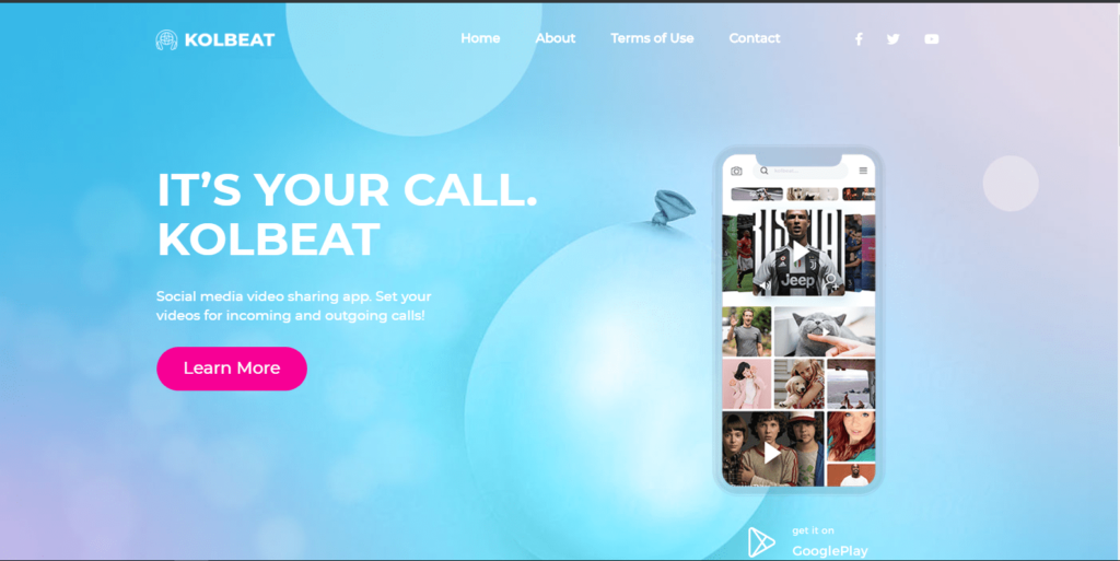
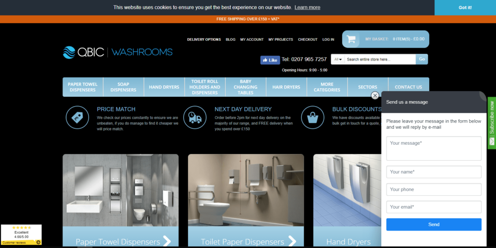
Refers to a website layout

Connect with end users and employees effortlessly

Increases productivity and saves times

Why Is Responsive Design Checker needed today?

Responsive design = good user experience. So, if you want to be offer your user a good experience (no matter what device they’re accessing your website from) you’re going to need a responsive site.

Not to mention, mobile usage counts for just about 50% of all website traffic, it’s essential that your site not only meet user demands but also adapt to any device screen.

Responsive Design: What to Expect

Start with the End in Mind
Create Complimentary Layouts
Expect Some Shifts
Programming Magic
Evolution
featured

Let’s Talk Something To Solve Something.

Looking for a quotation or need any technology advice, Let’s talk.